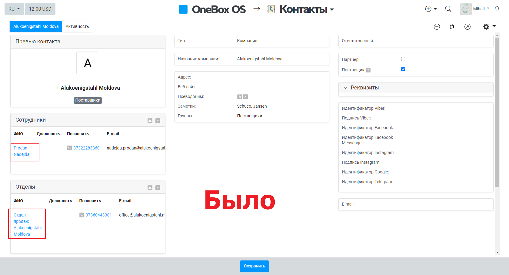
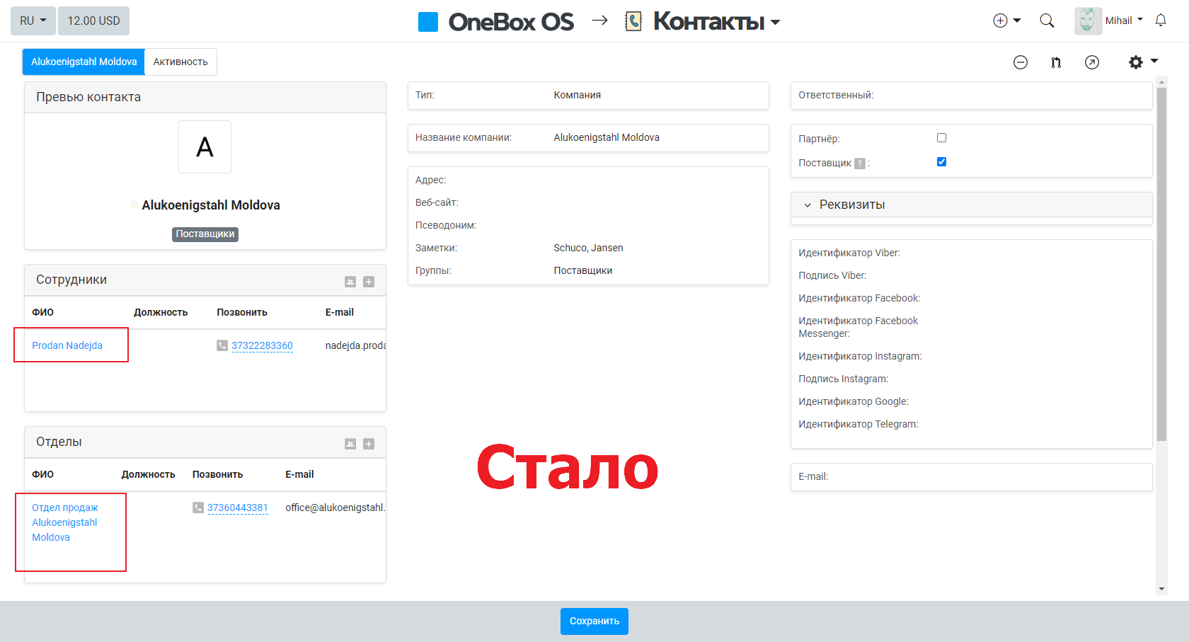
Dimensional grid of lists
There is a small request/suggestion to improve the interface. Because Because lists still become scrollable horizontally, you can make them easier to read.
Slightly increase the width to fit 2 words per line, first name and last name.
Thanks in advance.
Original question is available on version: ru
Slightly increase the width to fit 2 words per line, first name and last name.
Thanks in advance.
Answers:

Good afternoon. If you increase the width, then let everyone adjust the width of each column for themselves. It will take about 6 hours of refinement in this block. For example, you may have a 21-inch monitor and your name does not fit, I have 27 and my last name fits completely, i.e. column width, this is an individual setting for the screen parameters of each user. If you increase it by 10px conditional, this will not work, because it still won’t fit for a user behind a laptop.
09.08.2022, 13:50
Original comment available on version: ru
Da Hong Pao
OneBox production wrote:
Good afternoon. If you increase the width, then let everyone adjust the width of each column for themselves. It will take about 6 hours of refinement in this block. For example, you may have a 21-inch monitor and your name does not fit, I have 27 and my last name fits completely, i.e. column width, this is an individual setting for the screen parameters of each user. If you increase it by 10px conditional, this will not work, because it still won’t fit for a user behind a laptop.
Good afternoon,
Thanks for the answer. But after all, the block still becomes scrolling horizontally; why wrap words if as a result the block is stretched in height; this is not the best solution, in my opinion. And all these multi-line things in boxing are so hard to read, it's not only here. The point of what I propose is that when we look for something in the system, we focus on how we remember it - in this case visually. And if these things jump in the system - here in two lines, there in one, somewhere in four lines, then this is not a very good ux / ui solution. Some kind of competent standard regarding the interface is needed. For example, FI - do not transfer, and in the case of a full name, you can transfer O.
At the expense of refinement - not yet, because this whole system needs to be shoveled, and not just here, in order to make it convenient to work.
09.08.2022, 15:02
Original comment available on version: ru
Kornev Mikhail
ergo wrote:
why wrap words if as a result the block is stretched in height;
Is it possible that if you have a user with a full name with 100 characters, it fits there (3 lines and not one) and you don’t have to scroll half the page to see his number, for example?
Kornev Mikhail
ergo wrote:
Some kind of competent standard regarding the interface is needed. For example, FI - do not transfer, and in the case of a full name, you can transfer O.
let's do it again: you have a 15-inch mac air, I have a 27-inch widescreen, I don't need this transfer - everything fits in me, you don't even fit 3 fields. What is the general standard for a regular column of text? Want to avoid transfers? Okay, let's make the last name, first name and middle name separate fields and display them separately, each in its own column.
09.08.2022, 15:19
Original comment available on version: ru
Da Hong Pao
OneBox production wrote:
Is it possible that if you have a user with a full name with 100 characters, it fits there (3 lines and not one) and you don’t have to scroll half the page to see his number, for example?
Of course, there will always be cases out of the ordinary, but you yourself always cite standard cases as an example ... I'm sure that you can find a universal solution for most standard cases. For example: return the pop-up window, when hovering over a contact, which was removed in the OS version, make it display as cards, or some other options. But they need to be discussed with you, because. you have some experience and knowledge of the system.
Da Hong Pao
OneBox production wrote:
let's do it again: you have a 15-inch mac air, I have a 27-inch widescreen, I don't need this transfer - everything fits in me, you don't even fit 3 fields. What is the general standard for a regular column of text? Want to avoid transfers? Okay, let's make the last name, first name and middle name separate fields and display them separately, each in its own column.
I tried it, It also has its own nuances, because if the last name / first name is made of two words, then it also transfers them)) even e-mail is in two lines.
I perfectly understand that these transfers are made to fit all screens. Is it possible in the application settings to make a tick "transfer to several lines, or leave one line"?
And you can also make a customizable interface grid for the contact card, similar to the grid in the process, which can be customized.
Does anyone have any other ideas about this...
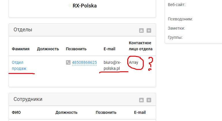
By the way, the screenshot shows that in this block there is a glitch with the contact directory field.
09.08.2022, 15:57
Original comment available on version: ru
Kornev Mikhail
ergo
Leave a message in this thread and you will see the user's contacts wrote:
I'm sure you can find a universal solution for most standard cases.
So it is and now works great. If a line is longer than a column width, it wraps. You just don't like it for some reason. For me, line wrapping if the length is greater than the column width works great.
Kornev Mikhail
ergo
Leave a message in this thread and you will see the user's contacts wrote:
For example: return the pop-up window, when hovering over a contact, which was removed in the OS version, make it display as cards, or some other options. But they need to be discussed with you, because. you have some experience and knowledge of the system.
I can't discuss such decisions with you because I don't make them
Kornev Mikhail
ergo
Leave a message in this thread and you will see the user's contacts wrote:
I perfectly understand that these transfers are made to fit all screens. Is it possible in the application settings to make a tick "transfer to several lines, or leave one line"?
Yes, you can - but then you will have different column widths in each contact card and thus there will not be a uniform interface. Somewhere there will be a surname from 1 word and somewhere through a hyphen 2 long ones. As a result, in the first case, you will get a visible last column and in the second, scrolling for the last 2 columns. Good decision? I think it's disgusting.
Kornev Mikhail
ergo
Leave a message in this thread and you will see the user's contacts wrote:
And you can also make a customizable interface grid for the contact card, similar to the grid in the process, which can be customized.
Is it possible, are you ready to invest in this functionality?
Kornev Mikhail
ergo
Leave a message in this thread and you will see the user's contacts wrote:
By the way, the screenshot shows that in this block there is a glitch with the contact directory field.
unfortunately I still don’t know how to fix bugs on screenshots) give me a contact card - you need to look at it.
09.08.2022, 17:26
Original comment available on version: ru
Thanks for answers.
Da Hong Pao
OneBox production wrote:
unfortunately I still don’t know how to fix bugs on screenshots) give me a contact card - you need to look at it.
in principle, in any card where there is a field with a multi-select contact directory
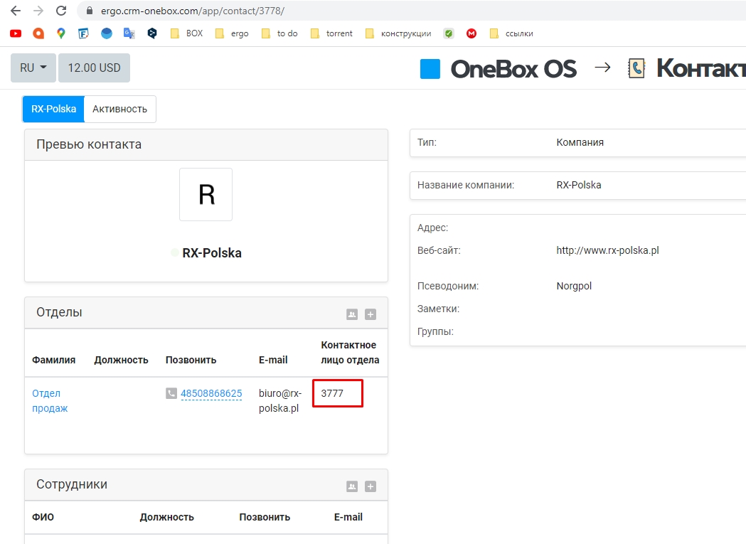
https://ergo.crm-onebox.com/app/contact/3778/
Da Hong Pao
OneBox production wrote:
unfortunately I still don’t know how to fix bugs on screenshots) give me a contact card - you need to look at it.
in principle, in any card where there is a field with a multi-select contact directory
https://ergo.crm-onebox.com/app/contact/3778/
09.08.2022, 17:35
Original comment available on version: ru
"Department contact person" you have a multilist as far as I can see, apparently the block cannot display it and tries to display it as an array.
09.08.2022, 17:42
Original comment available on version: ru
Da Hong Pao
OneBox production wrote:
"Department contact person" you have a multilist as far as I can see, apparently the block cannot display it and tries to display it as an array.
if the directory of contacts - it will be like on the screen.
submit a new ticket for this bug?
09.08.2022, 17:52
Original comment available on version: ru
Yes, please post a separate one if possible
09.08.2022, 18:01
Original comment available on version: ru
Please join the conversation. If you have something to say - please write a comment. You will need a mobile phone and an SMS code for identification to enter.
Log in and comment


Copyright © OneBox 2025


