OS - Process interface and top menu
Sat down today at the laptop to work from home.
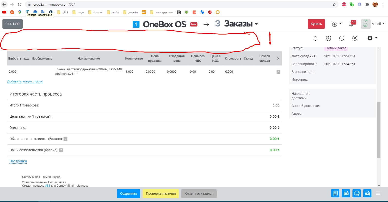
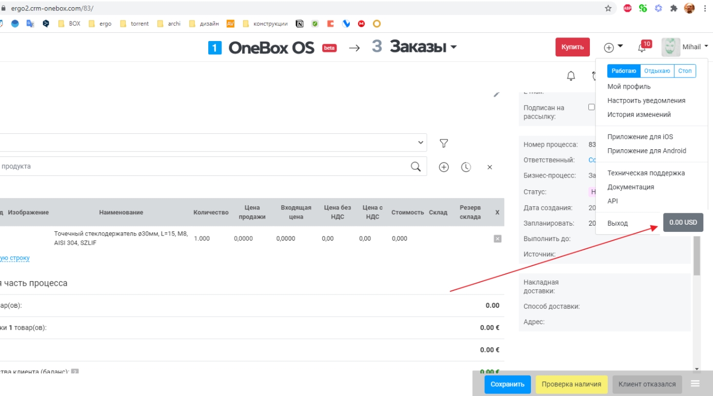
On a large screen, it doesn't feel like the top menu covers two whole lanes of the process interface, but on a laptop it feels like the menu overlaps too much. Now I understand my employees and other people who work on laptops and zoom out of the page to see more, but this is not normal!
In the MVP version, the process was visible in full screen height, which is convenient, but now non-functional "garbage" has appeared.
We propose to discuss the following options for resolving this issue:
1. Hidden top menu.
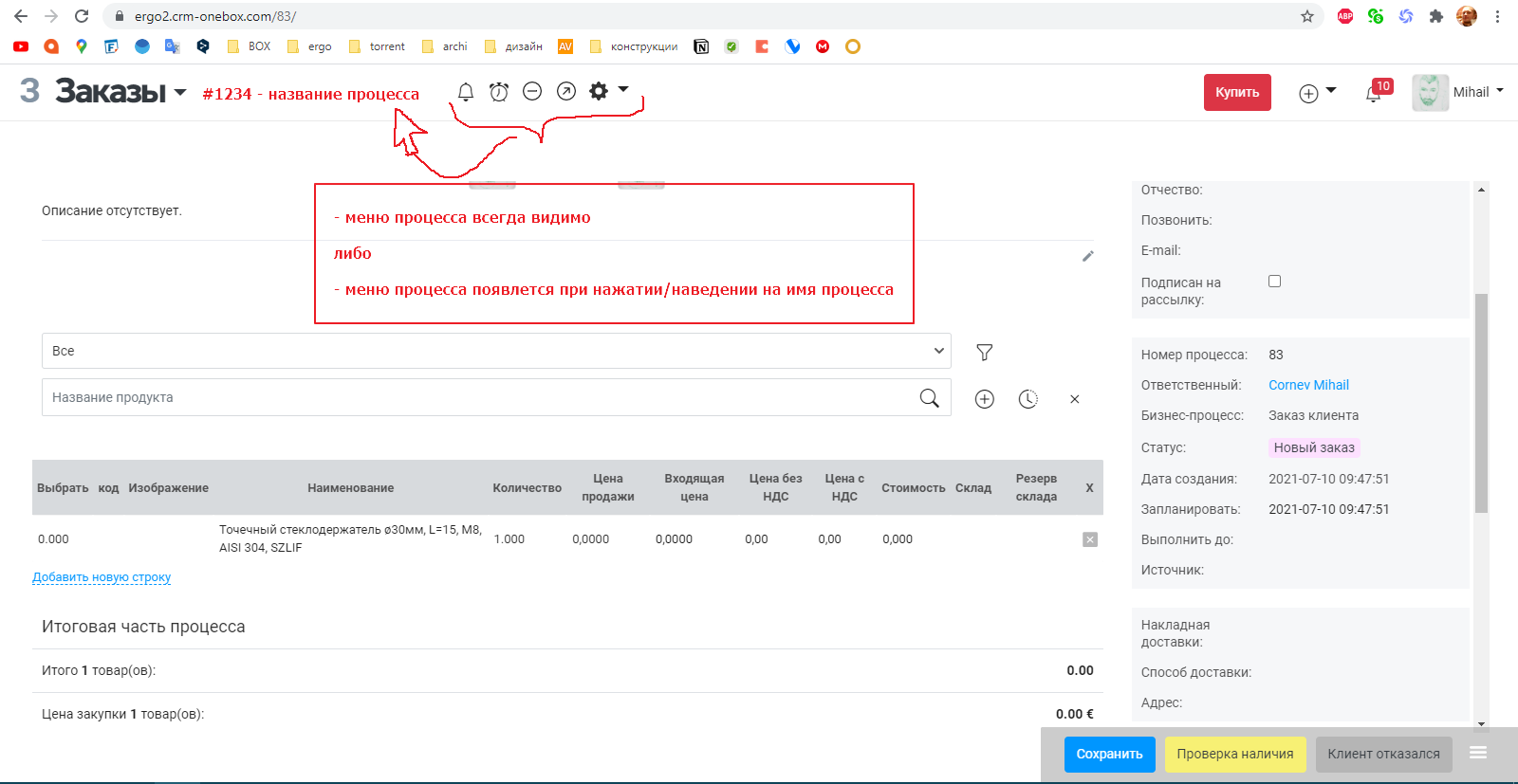
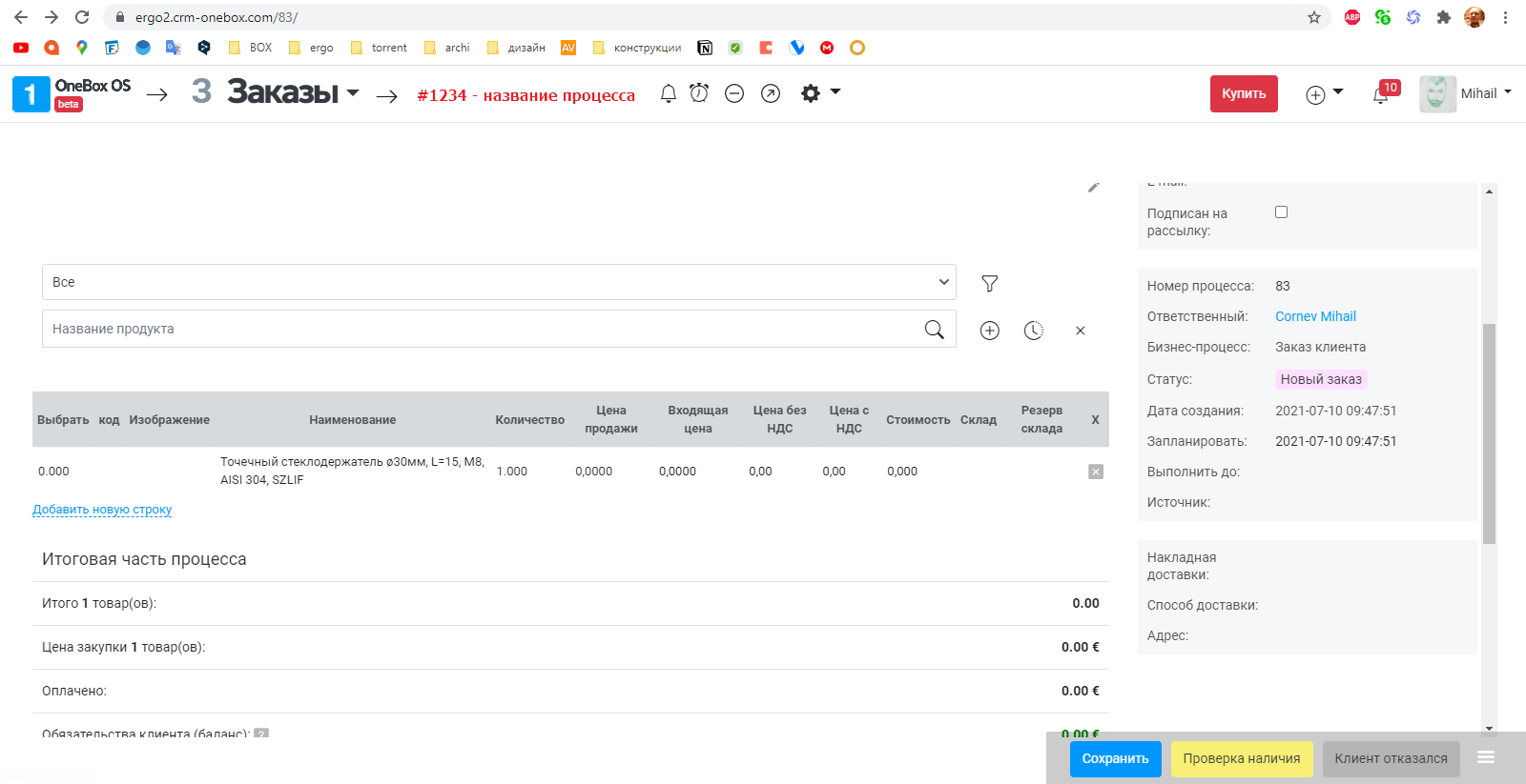
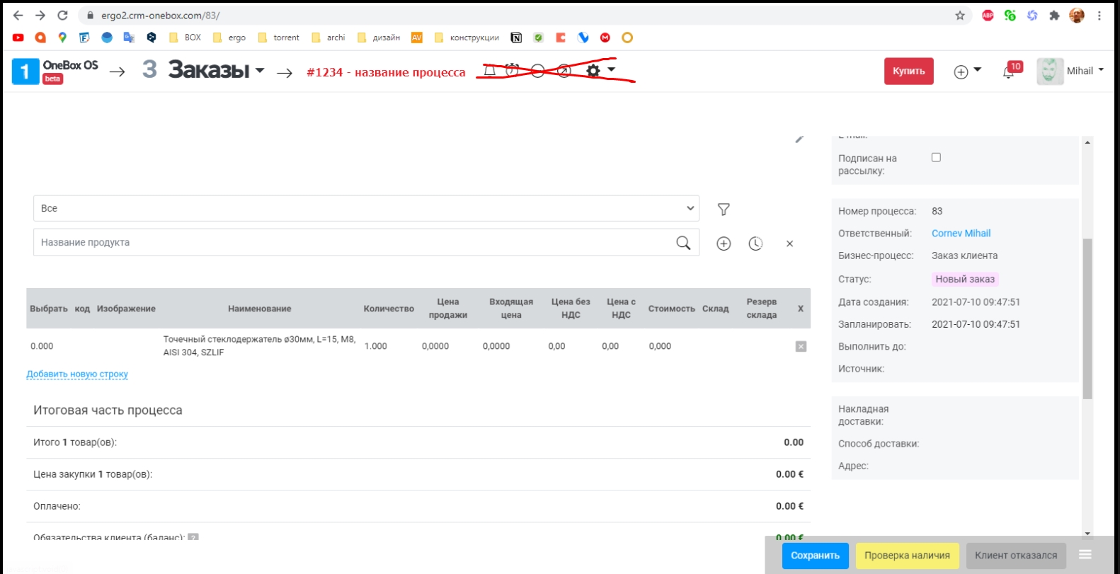
- the top menu is completely hidden while working with processes, and when you hover over the top edge of the page, it automatically drops out, and add an arrow on which you can collapse / expand.
Notion.so example - see video https://youtu.be/Mz6LZAgmVTc
2. Optimize the top menu.
- remove the boxing logo while watching Processes. In all other places, in principle, it
Original question is available on version: ru
On a large screen, it doesn't feel like the top menu covers two whole lanes of the process interface, but on a laptop it feels like the menu overlaps too much. Now I understand my employees and other people who work on laptops and zoom out of the page to see more, but this is not normal!
In the MVP version, the process was visible in full screen height, which is convenient, but now non-functional "garbage" has appeared.
We propose to discuss the following options for resolving this issue:
1. Hidden top menu.
- the top menu is completely hidden while working with processes, and when you hover over the top edge of the page, it automatically drops out, and add an arrow on which you can collapse / expand.
Notion.so example - see video https://youtu.be/Mz6LZAgmVTc
2. Optimize the top menu.
- remove the boxing logo while watching Processes. In all other places, in principle, it
Answers:
UPD: It turns out that now the empty space is intended for process tabs, but if there are none, then the place is simply empty.
11.07.2021, 21:20
Original comment available on version: ru

you propose to do some chaos)
on one page one way, on the other another...
I don't see any common sense here
on one page one way, on the other another...
I don't see any common sense here
12.07.2021, 10:00
Original comment available on version: ru
...not the first time instead of "answer" I accidentally click on "choose as the correct answer". ((((
Ustimenko Igor
OneBox production wrote:
you propose to do some chaos)
what is the chaos? quite adequate and very functional ideas.
to make adequate and correct breadcrumbs, since you started doing something like this - it should be as a standard, everywhere in the system it should be the same. shifting all this to the left will also be more convenient and there will be a place for additional information.
https://youtu.be/rD1liBFM1gY
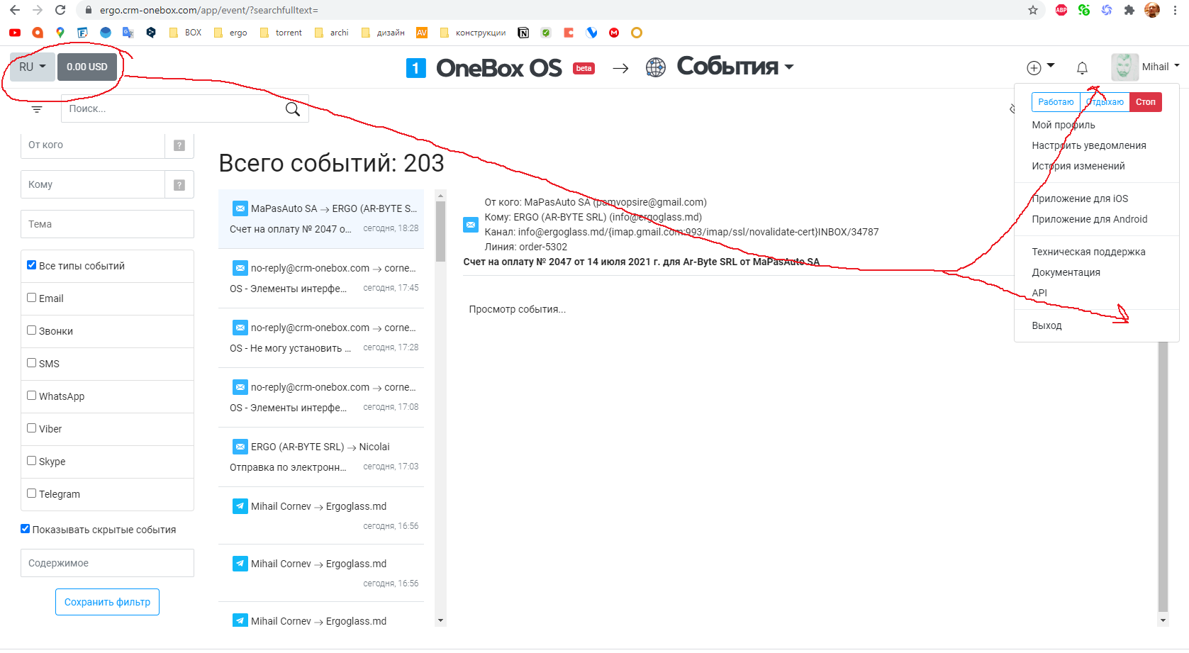
1. move the logo to the left, place breadcrumbs to the right of the logo.
2. Everywhere in the system you need to add a path or breadcrumbs. this disease with their absence stretches from the version before MVP.
3. account balance and language switch button is generally something that should not be on the main screen. such things should be hidden in the personal menu. it only eats up space for, again, more important information.
Ustimenko Igor
OneBox production wrote:
you propose to do some chaos)
what is the chaos? quite adequate and very functional ideas.
to make adequate and correct breadcrumbs, since you started doing something like this - it should be as a standard, everywhere in the system it should be the same. shifting all this to the left will also be more convenient and there will be a place for additional information.
https://youtu.be/rD1liBFM1gY
1. move the logo to the left, place breadcrumbs to the right of the logo.
2. Everywhere in the system you need to add a path or breadcrumbs. this disease with their absence stretches from the version before MVP.
3. account balance and language switch button is generally something that should not be on the main screen. such things should be hidden in the personal menu. it only eats up space for, again, more important information.
14.07.2021, 18:57
Original comment available on version: ru
Commentary is available in ru and not yet translated to the current language.
14.07.2021, 19:00
Please join the conversation. If you have something to say - please write a comment. You will need a mobile phone and an SMS code for identification to enter.
Log in and comment


Copyright © OneBox 2025


